
Explore Your Favorite Color Palette
- Heidi Cogdill
- Jan 22, 2020
- 3 min read


This week we’re continuing to explore colors and how colors affect our emotions. Your project will be to create color swatches and color mixing charts using watercolor paints.

Colors Swatches
Starting with the paints you currently have on hand. I want you to swatch out each color so you can get a true sense of the base colors you have. If you only have a limited palette of primary colors, that’s ok to start with. If you’ve got a couple of palettes or lots of miscellaneous paint tubes lying around, I want you to swatch those out, so you get a clear idea of what colors you are starting with.

Once the swatches have dried, I want you to select your favorite colors. The ones that the second you saw them; you felt a pull in your gut. The emotions these colors may have brought up could be happy and joyful or even a bit sad and lonely, but for whatever reason, they spoke to you. That’s the feeling I want you to focus on for the next step of this assignment.
Color swatch palettes are such fun to make. They are not only relaxing, but they are beautiful in their simplicity.
These can be used as bookmarks, or even framed and hung on your walls. They can be added to art journals and collage journals.


I have these little color palettes all over my office and I find them in old books all the time.
Color Mixing Charts
This can be really fun to explore your current paints and all the amazing colors they can create. A very limited palette can create a plethora of beautiful colors, so don’t think you can do this step if you only have a couple of colors.
I’ve included a 6-color mixing chart for you to download and use as a template when creating your own color mixing charts.

Download: 6-Color Mixing Chart PDF
Using a lightbox, or even a window to trace the chart onto the watercolor paper of your choice. I like to use Canson Cold Press Watercolor Paper in 140lb.
There are a few ways of creating color mixing charts, but for today I’m going to show you two different ways.
Option 1: Same color selections on horizontal and vertical lines.

Once you have your chart traced onto your paper, paint the first vertical column with your selected colors. I like to use a deeper color in this color. In other words, use less water when picking up your paint. On the horizontal row, use the same six colors, but this time add a little more water to create mid-tone colors. Finally, add a light wash, by adding a lot more water to your paint selections and add those down the diagonal line.
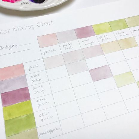
Once your colors have dried add the names of your paint colors for future reference.
Now that the first lines are dry, let’s begin to color mix.
When color mixing, I use the deeper colors on the first vertical column, add in a smidge of the horizontal mid-tone color and mix together, then add the paint to the correct box. I work through the entire sheet this way.

Then when filling in the remaining colors, you’ll take the mid-tone colors from the horizontal line and add a smidge of the deeper tone from the vertical column and mix together, painting in the remaining boxes.


Option 2 Mixing different colors together
For this option, you’ll select 6 colors for the horizontal row and 6 colors for the vertical column. Working through the sheet the same way as option 1, but this time you’ll be mixing different colors together and creating new colors, rather than mixing the same colors with different tones.

Project
The final piece of this week’s project is to create something with your color palettes or color mixing. The options are unlimited so let your imagination run wild. I’m not going to give you a ton of direction on this one because I want to see what you come up with.
My hope is you’ll share your projects with us. I’d love to see your palettes and what you created with them. Tag me so I can see everything using #monthlycreativeconversation
Next week I'll share the project (along with process video) I created using my selected colors. Have fun this week making swatches and color mixes. Turn on some music or your favorite Netflix show and let the colors play together. I can't wait to see what you all come up with!


Comments